All about alt-text
What is alt-text? Why does it matter? And how can you go about writing it so that your website is more accessible? Comma Chameleon explains everything…

What is alt-text?
Alternative text is not a hipster way of writing. It’s much cooler than that. What alt-text is, is an invisible description of any image displayed on a website, and it’s designed to make the content more accessible to viewers using assistive technology. Alt-text is added to a website’s HTML code so that it can be read aloud by screen readers, giving details about the images in a way that adds context and value for the users. Without alt-text, images are rendered pointless for users of assistive technology. With unhelpful or downright misleading alt-text, you can pretty much consider yourself dead to that viewer.
Picture this
Imagine being a visually impaired user listening to the content of a blog. Your screen reader is doing a champion job of articulating every written word. It’s a blog on a subject about which you care passionately, and it’s enthralling. The blog has set the scene, and you’re getting to the nitty-gritty. The writer, someone you admire as a pioneer in their field, makes reference to a ground-breaking study that has turned up some game-changing results. These results, it says, are shown in the graph below. You’re on tenterhooks, desperate to find out what could possibly be so monumental. And right then, at that critical point, your screen reader intones, with perfect poise, ‘5927655.jpg’. Ugh.
Across a sample of one million pages, WebAIM counted more than 36 million images – and more than half of those images had either missing, misleading or irrelevant alt-text.
Common problem
Unfortunately, missing, misleading and inappropriate alt-text is a common problem faced by people with accessibility issues. In an extensive survey by web accessibility non-profit WebAIM, it was discovered that around half of all images encountered by users with disabilities had inappropriate or missing alternative text. Across a sample of one million home pages, WebAIM counted more than 36 million images – and more than half of those images had either missing, misleading or irrelevant alt-text. When you consider how many of those images would have been used to add clarity and value to content, it’s unacceptable to think of how often web users with accessibility issues are left in the dark.
So what can you do about it?
How to write better alt-text
These days, it couldn’t be easier to add alt-text to every single image you place on your website. When web content management systems like WordPress and Wix are so widely used – and so user-friendly – it’s inexcusable for there to still be so many inaccessible websites out there. So how can you make your images do the job for any viewers using assistive technology? Here are a few simple pointers for writing better alt descriptions…
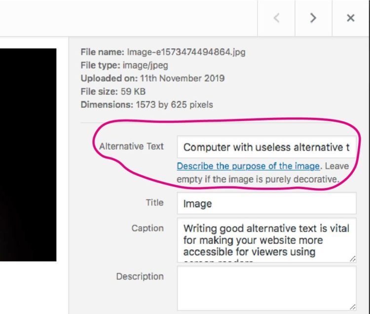
Content management systems like WordPress and Wix make it so easy to add alt-text to images – there’s really no reason to not add it as standard.
- Keep it simple, but be specific
The recommended length for any alt-text description is 125 characters. That’s shorter than a Tweet. And that means you don’t have enough space to waffle on about the irrelevant aspects of your image. If the background colour doesn’t add value to the viewer, don’t mention it. On the other hand, if it’s important that the subject of your image is a child rather than an adult, say so. Think about why you’re including that particular image on your page in the context of your written content and write only information that helps to convey that function.
- Describe information, not aesthetics
Most people using screen readers to view websites agree that what a page looks like doesn’t matter. What they want to know is what any images mean in the context of the written content. For this reason, you don’t need to write alt-text for images you’ve used for decoration or to break up large chunks of text. For all other images, think about what information you would sacrifice by not including them and use that to guide what you write in your alt-text description.
- Punctuate as normal

FREEBIE ALERT! Download and keep our top tips for writing better alt-text.
Commas and full stops can make it easier for screen readers to understand your alt-text descriptions. How this technology reads out the information about your images will obviously have an impact on the person using it, so make sure you punctuate your descriptions properly.
If punctuating is your nemesis, it might help you to read your alt-text aloud so you can see where you need to insert a pause or a break.
- Don’t waste your characters
You don’t need to start your alt-text with ‘This is a photo of…’ – most screen-reader users will know when they have reached an image and will read the descriptions accordingly. Another thing you can leave out is any copyright or credit information – this is the least important information in terms of experiencing an image as somebody with a disability or visual impairment. Reserve the alt-text for information that adds value to the viewer – everything else can go in the caption.
- Refer users to text elsewhere
There are times when 125 characters just isn’t going to cut it in terms of getting across everything you need to about an image. In these circumstances, don’t just give half the information you need to, because this does a disservice not just to your user, but to you and your content as well. If your image is a chart, diagram or infographic that adds value to the rest of your content, use your alt-text to direct screen-reader users to a more thorough text description located elsewhere on your page.
And that’s it. Easy peasy. Apply these few simple rules, and you’ll be golden, with a website that is accessible and meaningful for anyone who comes across it.
Go further…
Want to make all your content more accessible? These handy help sheets from the UK Home Office are packed with great advice for designing for accessibility. Download them. Keep them. Print them out and give them to your design team. Let’s make sure we’re all reading from the same page.

The UK Home Office has a great set of posters for designing content with accessibility in mind.
Cheers,
The Comma Chameleon team.

